Empirical Interfaces, Inc.
Founder, Product Designer, Software Engineer · 2011 - 2015
Co-founded Empirical to create novel ambient and social apps incorporating AI, raising $1.4MM from Floodgate and Greylock. Product design and full-stack software development specializing in network to front-end, custom front-end iOS libraries spanning Obj-C, Swift, Scala, Python, Built and launched Gather, Iris, Smalltalk - products ranging from data summarization for ambient displays to deeper and more meaningful social experiences when sharing content in small groups.
We built many products - below you’ll find four of the more interesting ones. A lot of these are a bit challenging to represent in a portfolio, so think of what’s below more of a way to pique your interest.
Always happy to chat more about these!
Gather · 2015
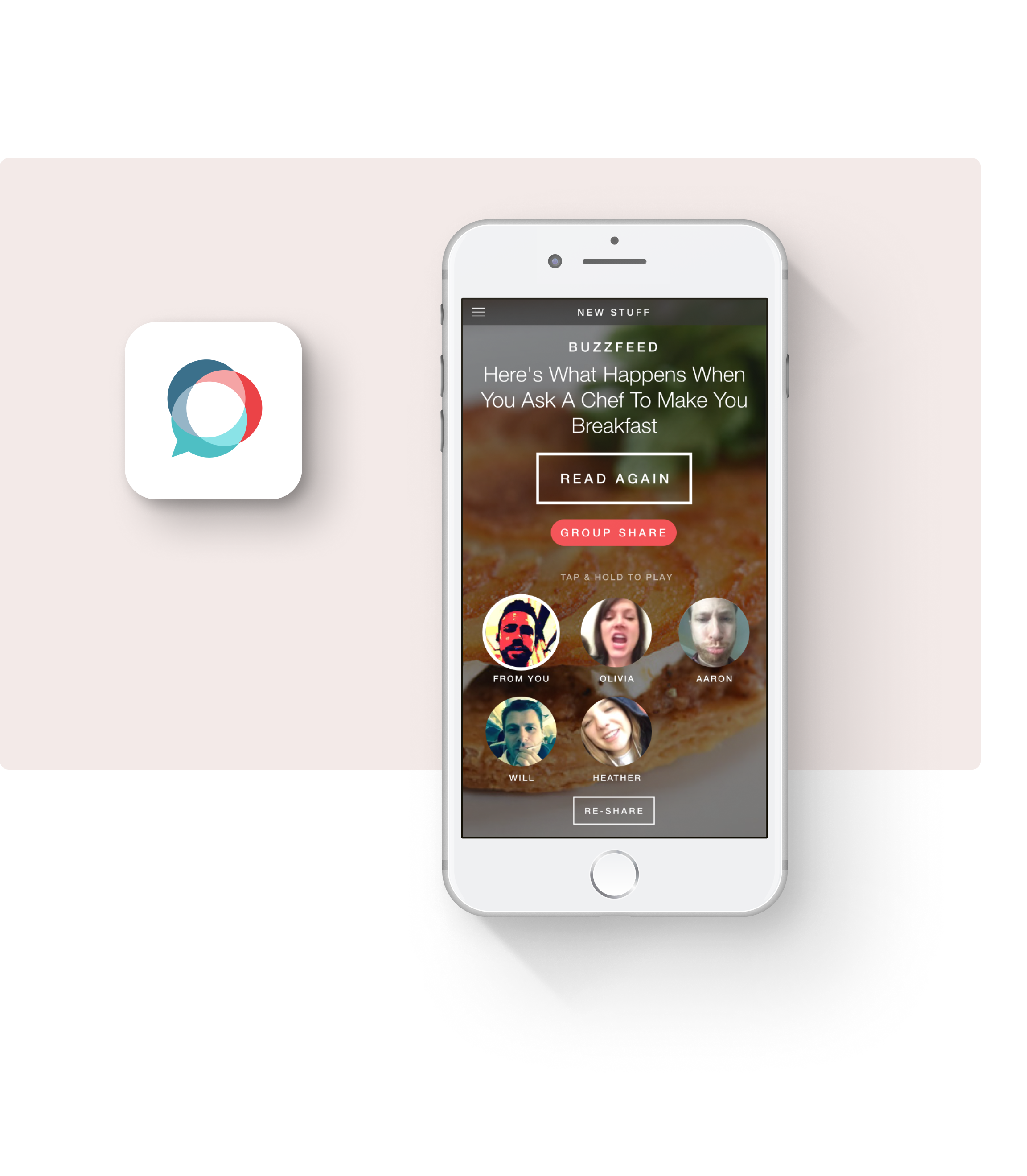
Meaningful interactions by reducing broad sharing and focusing on smaller, intimate shares where comments are replaced by short video reactions. Small sizes of videos and live filters reduce insecurity, intentional recipient, selection.
At a technical level, Gather achieves fast load times, insanely small video file sizes for fast uploading and downloading on poor networks, robust interactions for recording and playing, and aggressive caching that creates a surprisingly snappy experience.
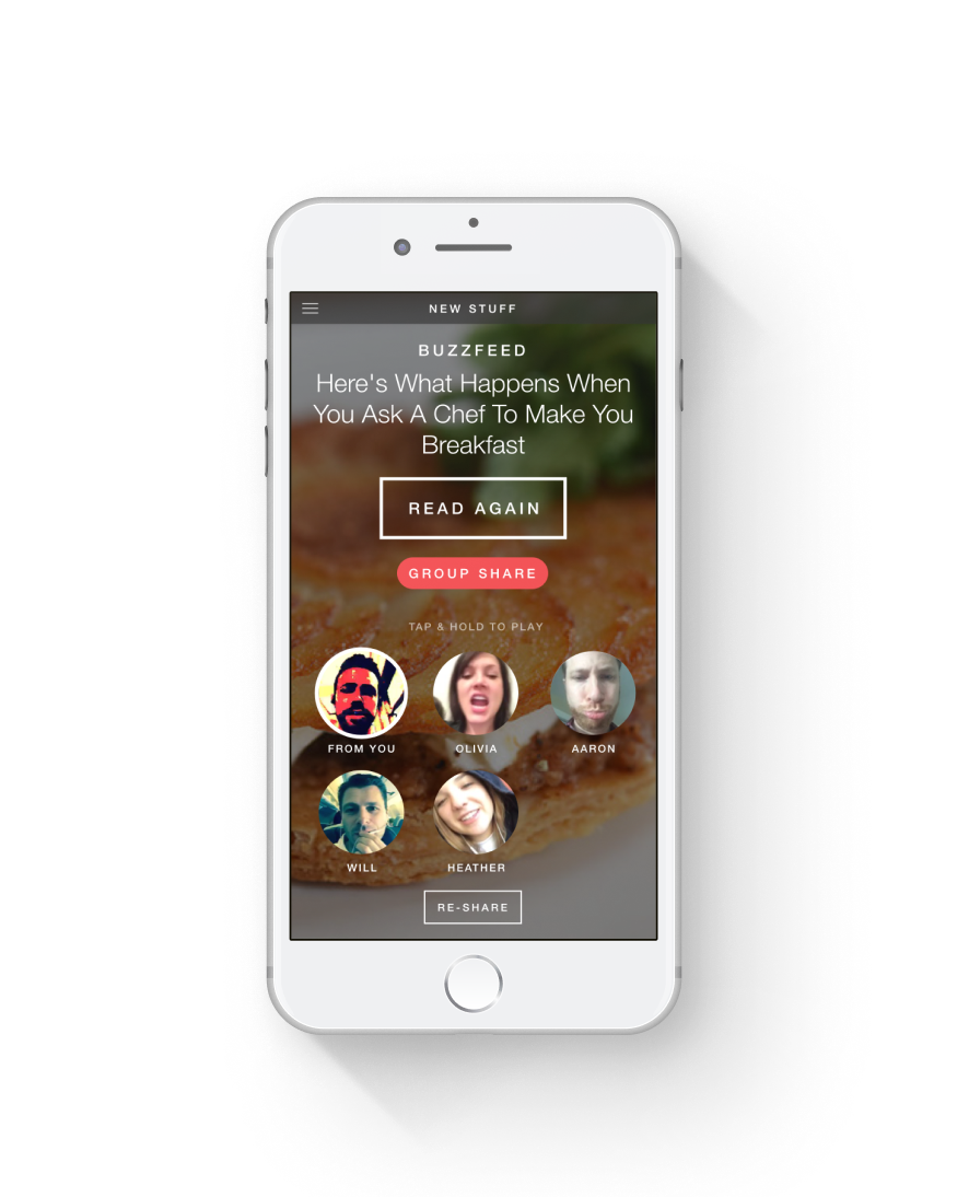
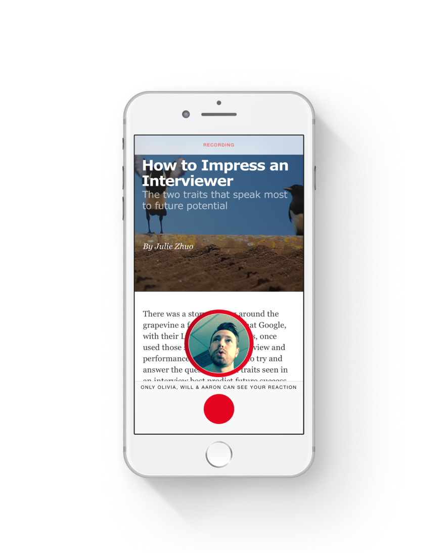
Share & react
An article sent to a small group with reactions from friends.
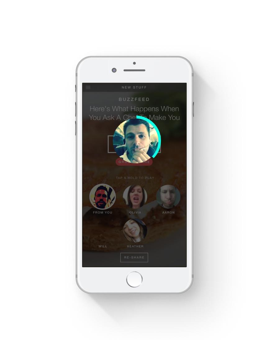
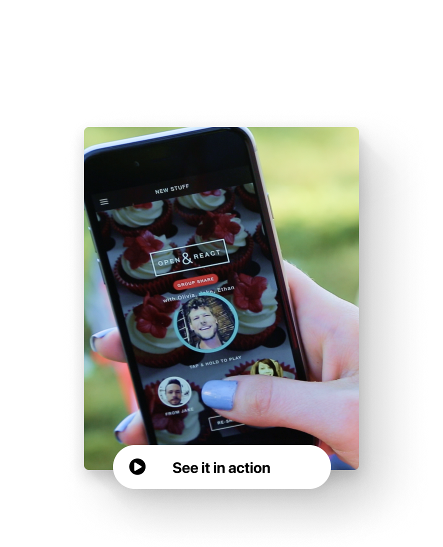
Watching reactions
Tap and hold to watch a video reaction from a friend.
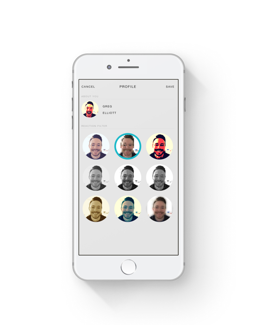
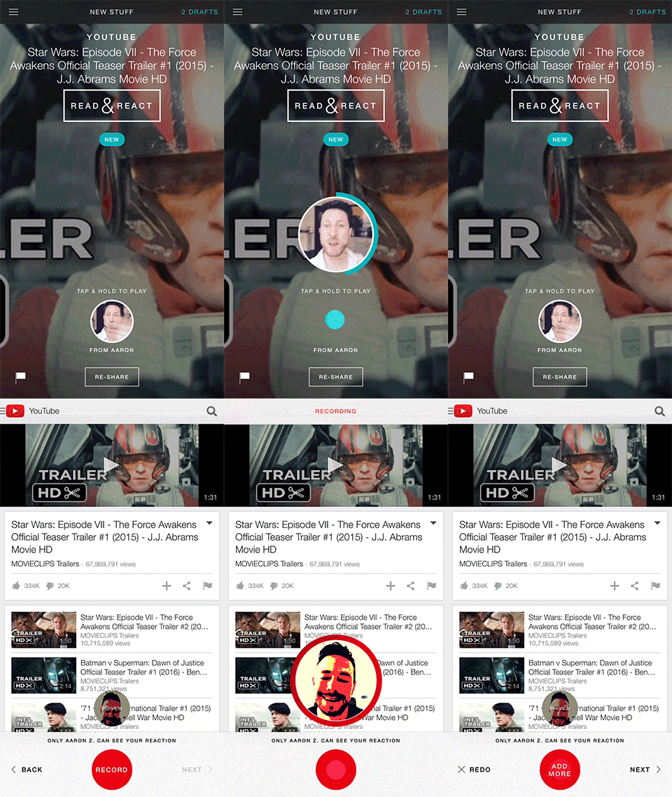
Filters to feel good
Small sizes of videos and live filters reduce insecurity, intentional recipient, selection. All filters shown live using QT libraries.
Pro-Controls · 2015
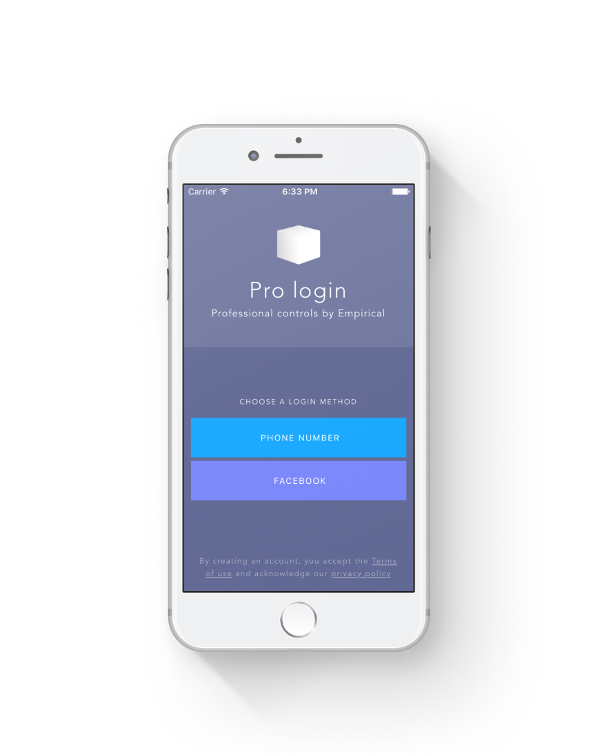
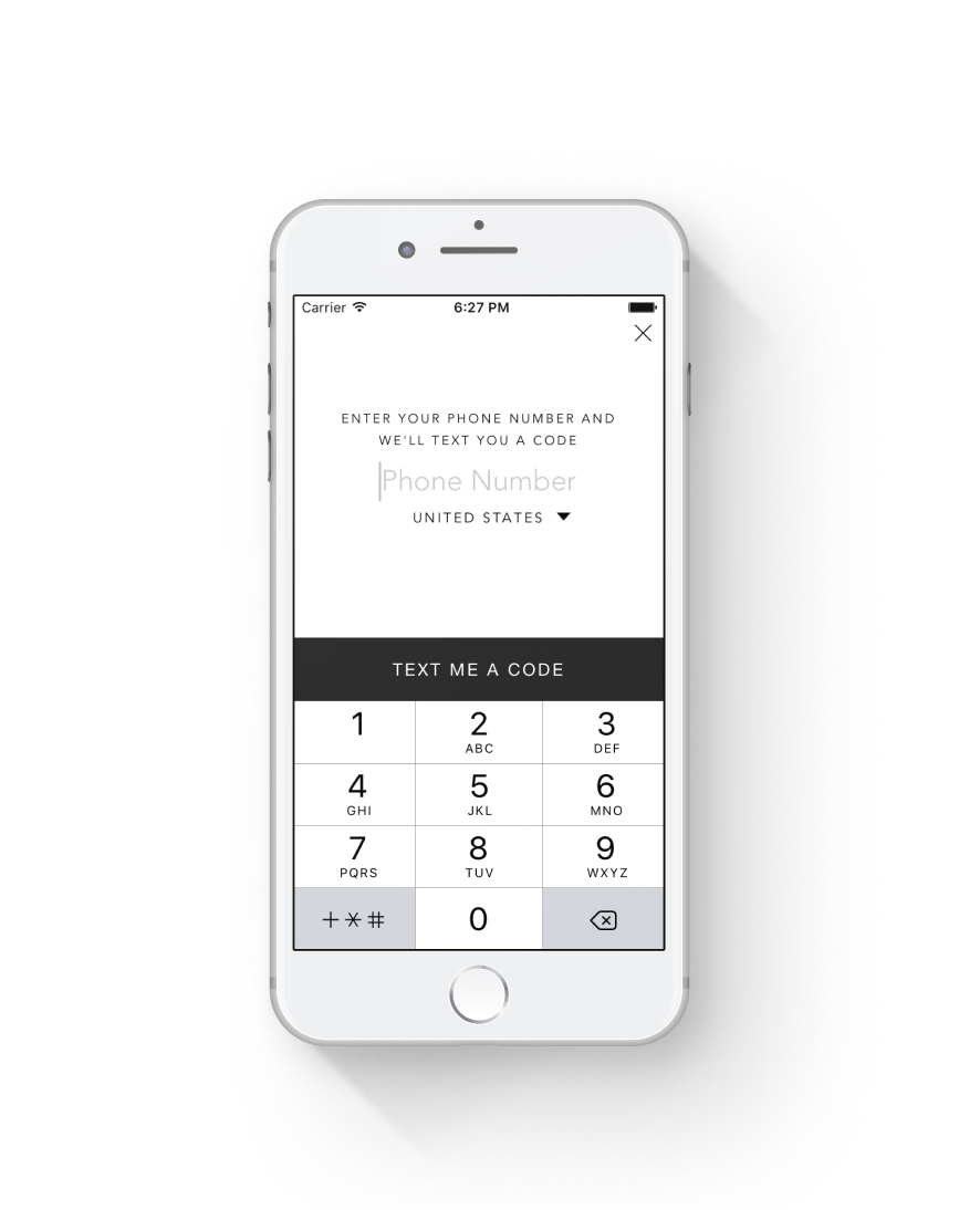
A collection of professionally designed iOS controls made up of fully-functional UX, code, and style. Vastly reduce the cost and time of development with components for Login, Permissions, Chat, Profiles, Onboard, etc. Full product design and a state machine-based architecture that exposes the right hooks for you to get in an override whatever.
I delivered product design and full-stack software development specializing in network to front-end, custom front-end iOS libraries spanning Obj-C and Swift - specifically I built front-end frameworks, designed and built the components, and built easier-to-use versions of core iOS UI components.
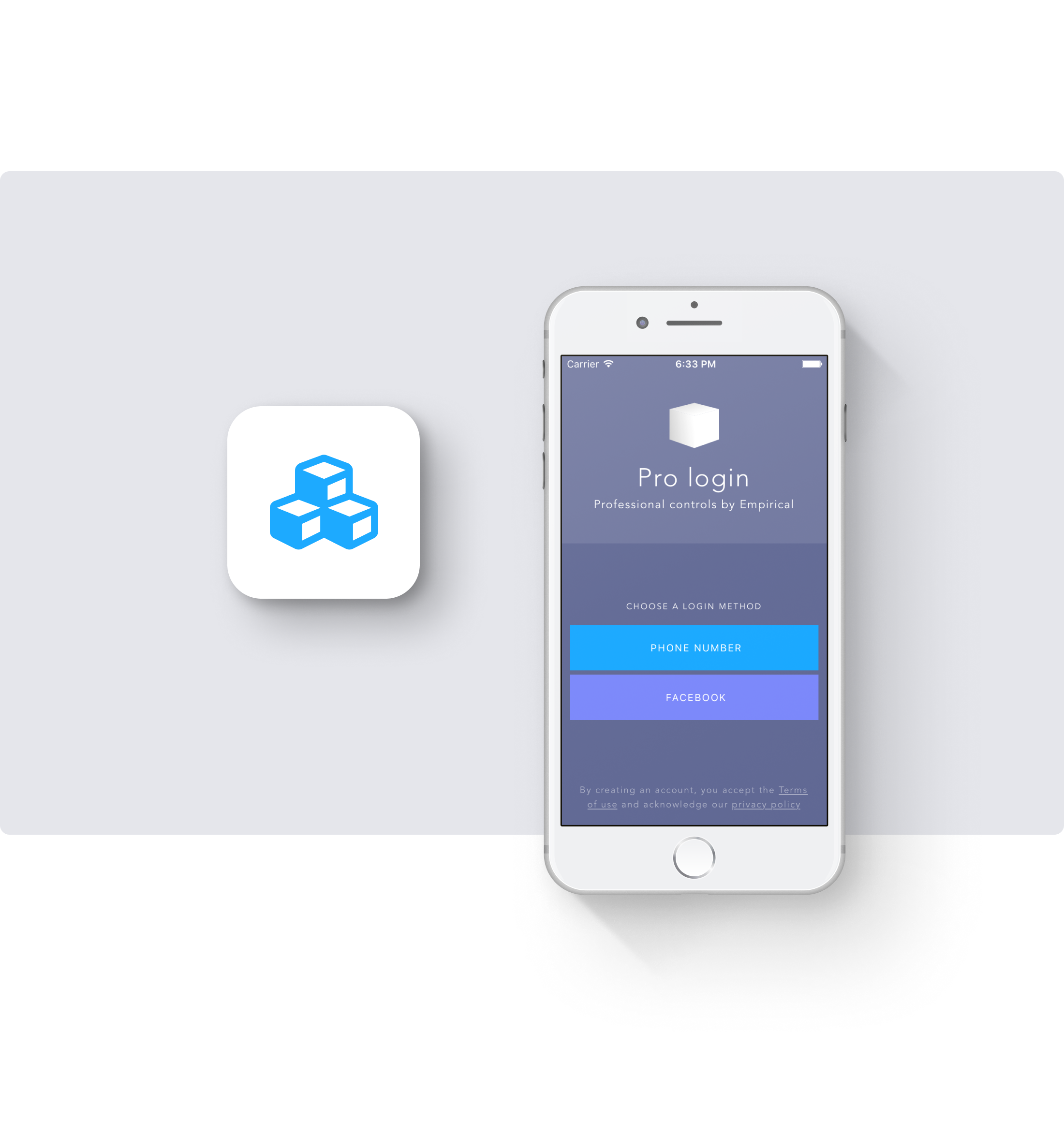
Sign in / Sign up
Phone, email, and social media sign in / sign up, 100% ready to go.
Themeable
Easily swap your style, colors, and type to match your app.
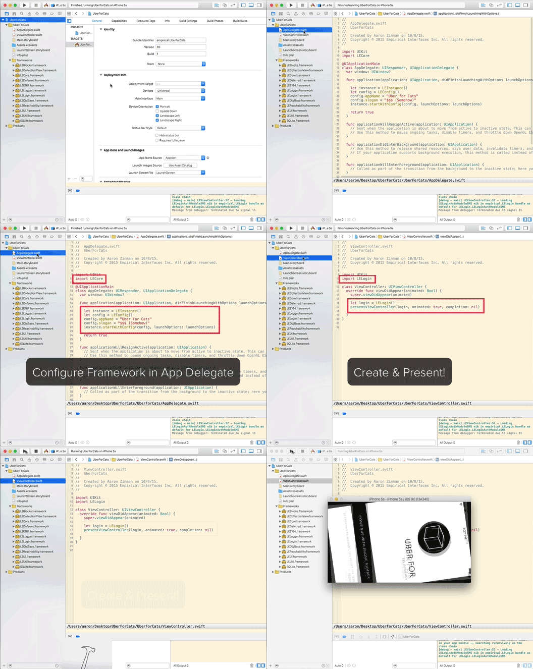
Drop in and go
Drag in frameworks, initialize it, then start using the pre-made components. Get to MVP faster.
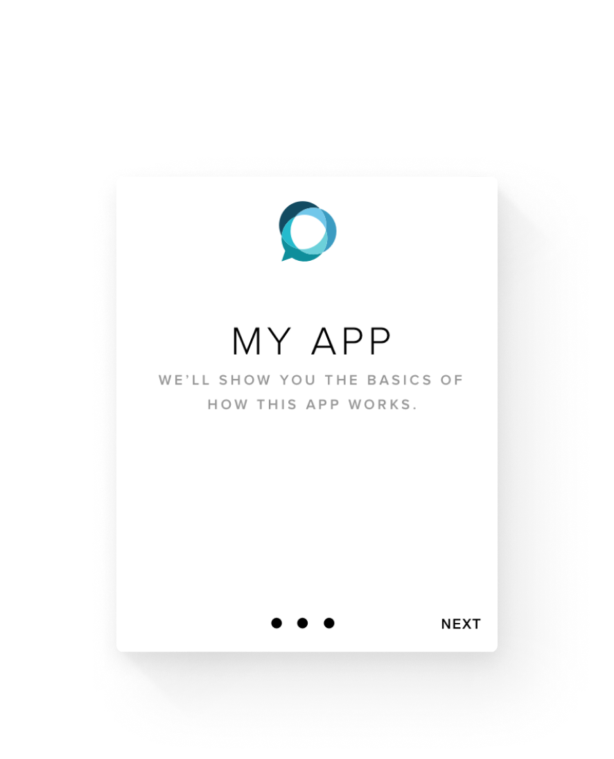
Onboard
A polished, ready-to-go onboard with tutorials and sign in. Let’s stop writing onboards over and over again.
Timeline
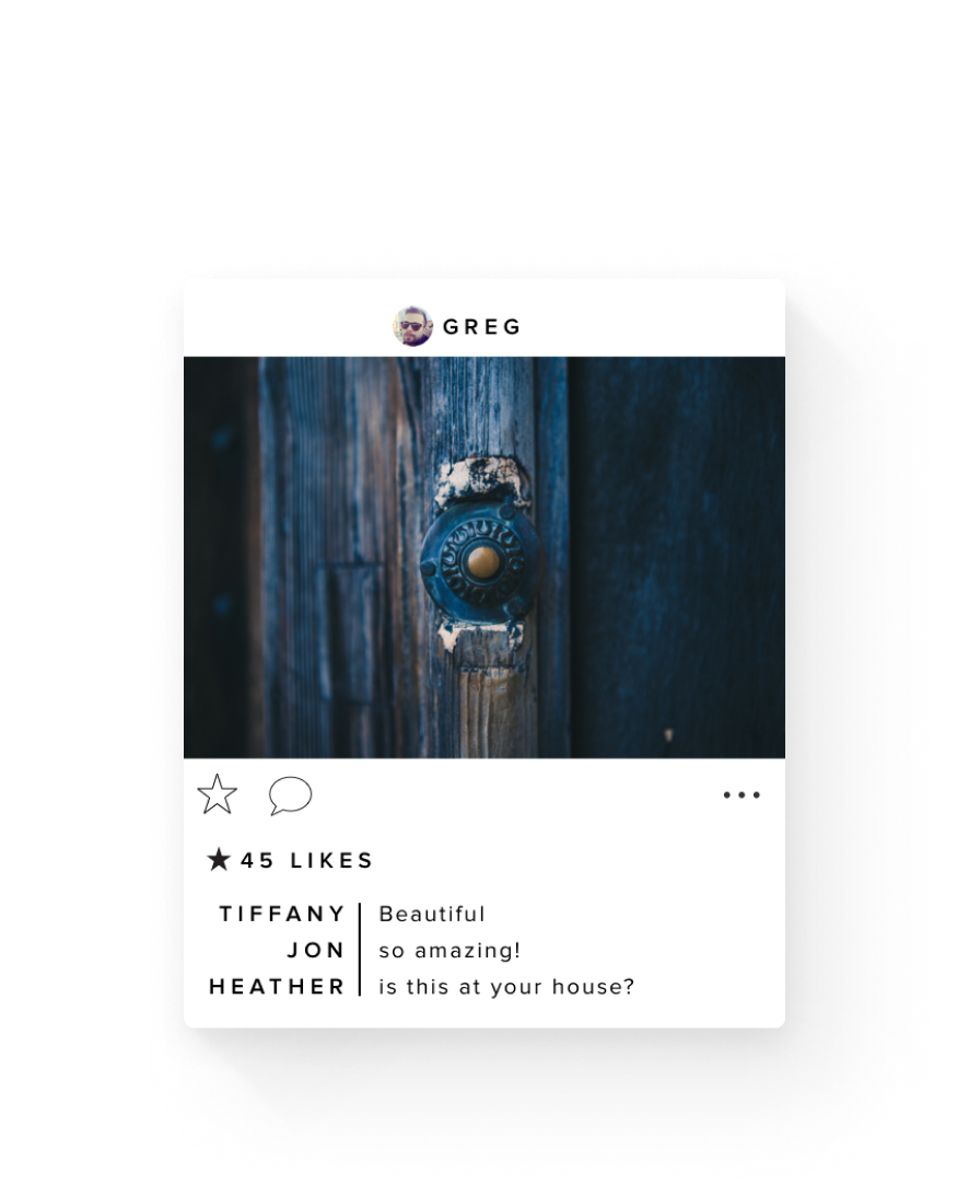
Instagram-like collection view with built-in comments.
Chat
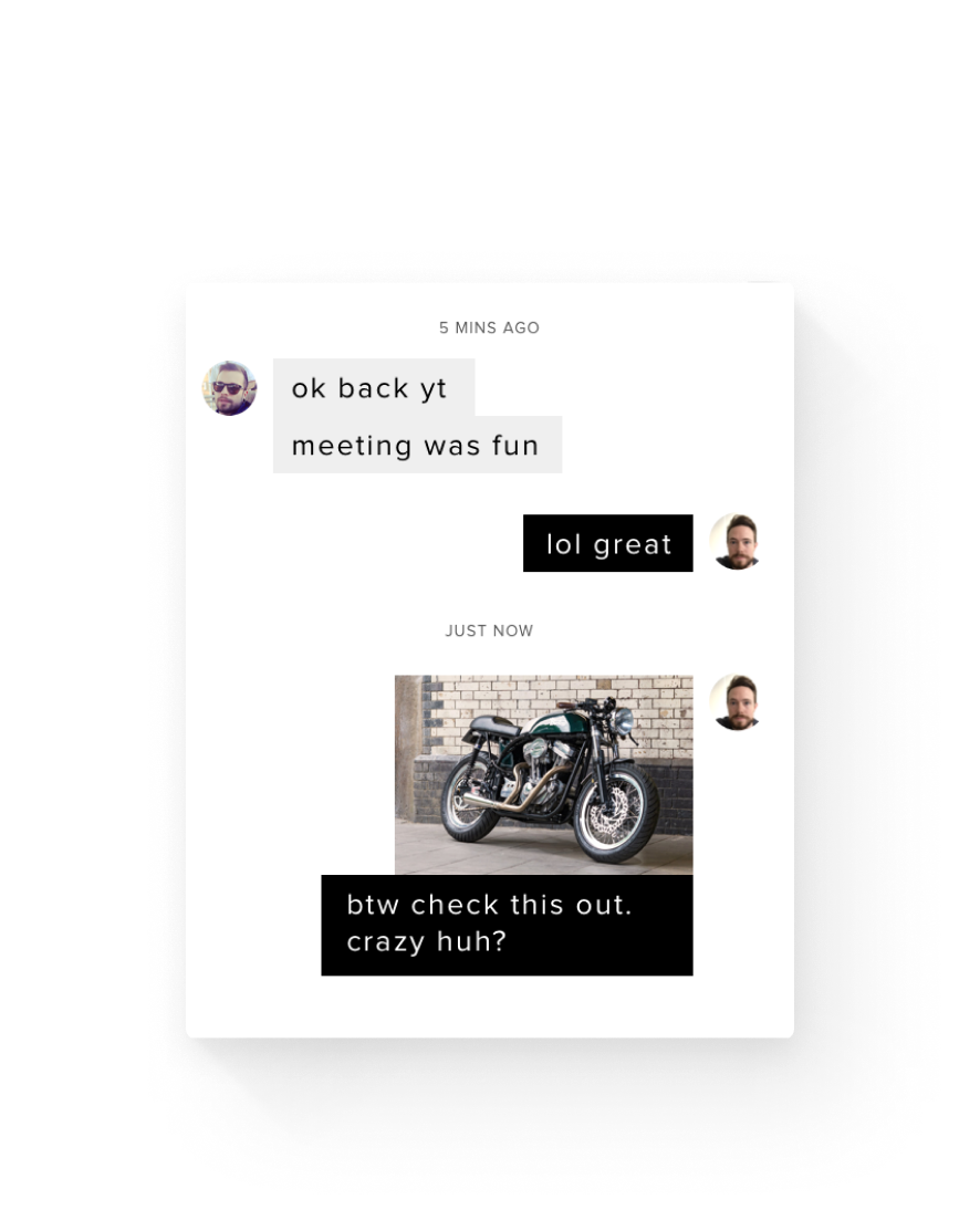
Sorted out and reliable. Always harder than it seems.
Small Talk · 2014
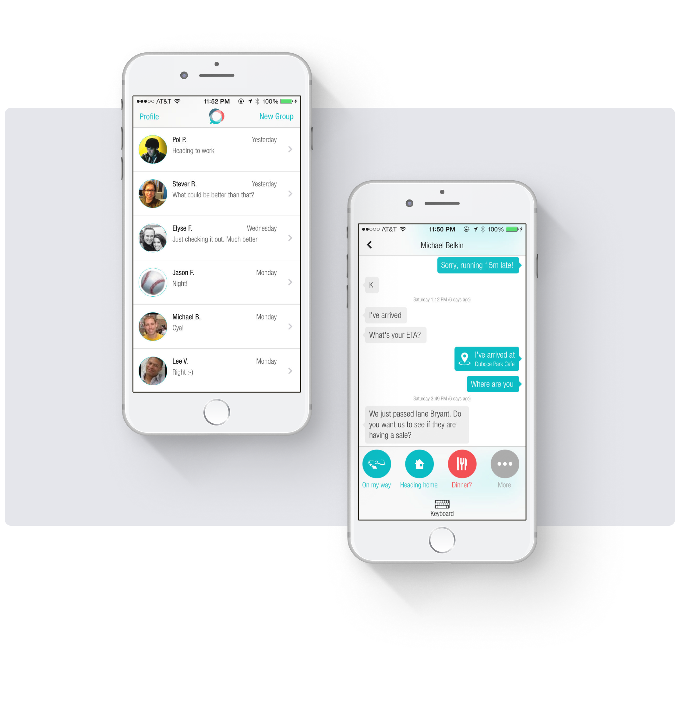
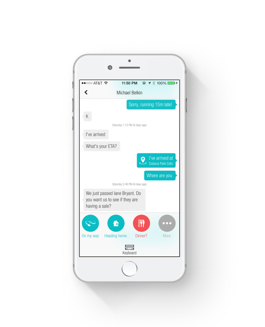
At Empirical, we found ourselves texting the same things over and over, often in a structured workflow. SmallTalk was an intelligent chat app with one-touch buttons for common communication flows.
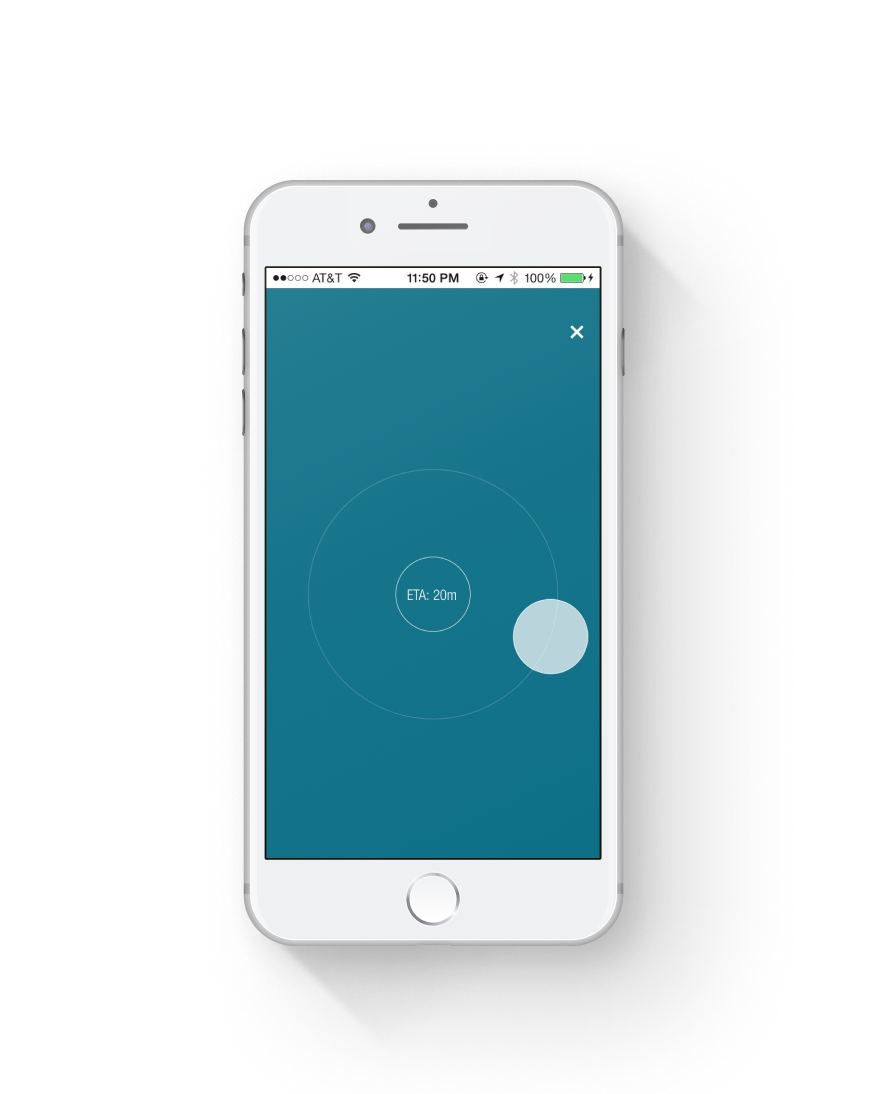
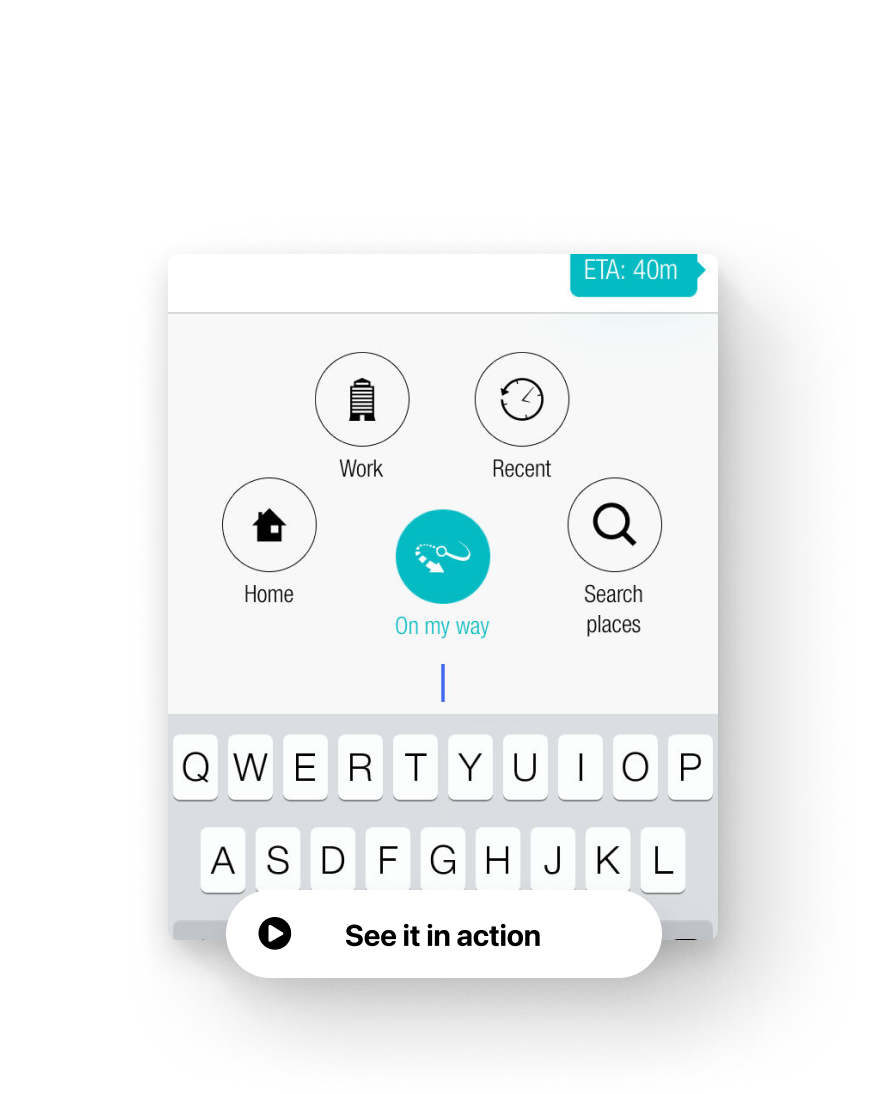
These designs are quite dated now, but what’s important are the interactions and flows. We created novel UI for these flows: “on my way” was a tap and had follow-up actions like “running late” or “send location.” Each of these actions introduced unique UI based on their intent - something we learned from Iris.
I was responsible for networking, model, front-end, components, prototypes, and design.
SmallTalk
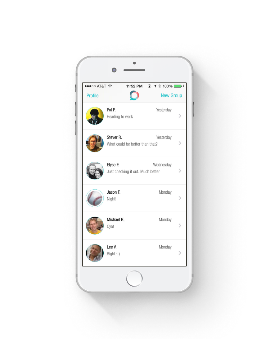
Empirical’s attempt at first-class data objects for communication.
Structured actions
Contextual actions and structured communication based on the content of the messages combined with state.
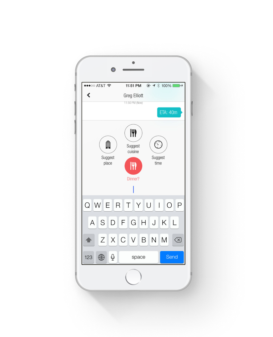
Fooding
Negotiating breakfast, lunch, and dinner was so repetitive and often had us pasting in links to restaurants. SmallTalk integrated in directions, reviews, and more. Actions changed based on state.
Iris · 2011
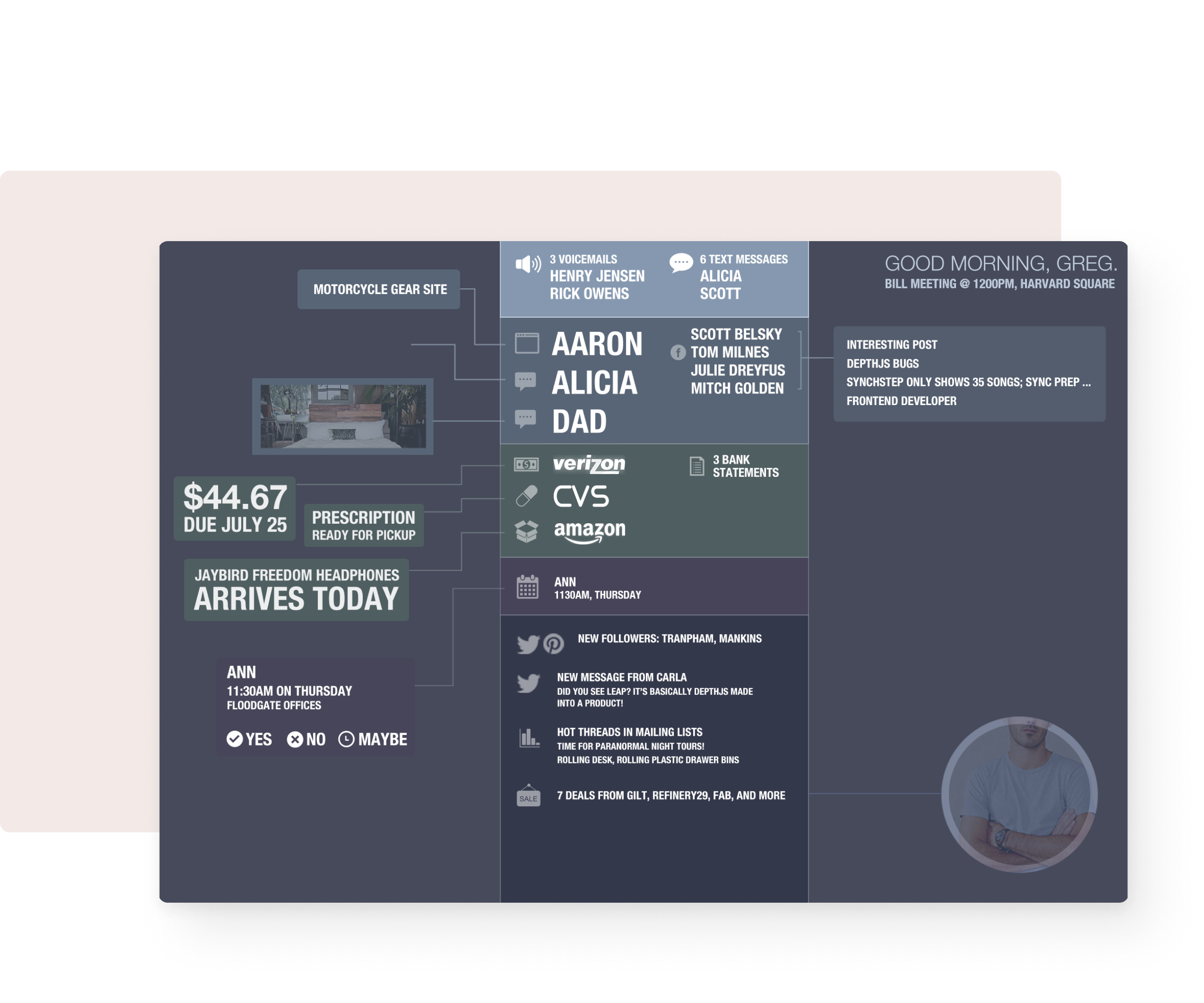
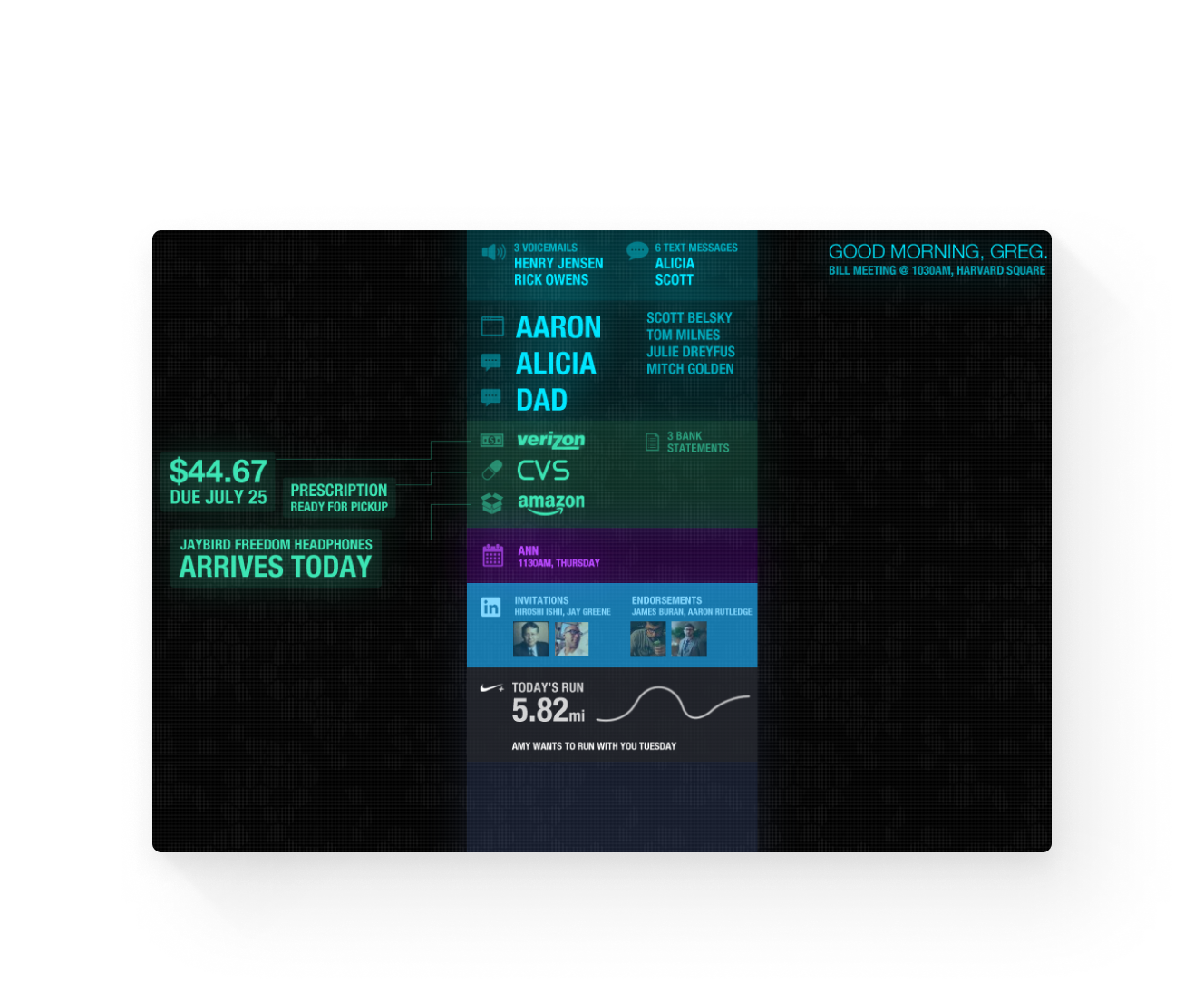
Information-centric calm summaries. In a future where physical walls contain invisible displays and where vehicles have large displays, what does data look like? In a post-app world, how do we interact wtih information directly instead of deciding which App contains what we want to see?
Iris was the idea that got us funded - to focus on surfacing data that mattered when it mattered wherever it came from. We started with email as a source.
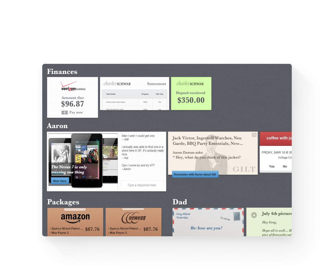
Further, we asked what would happen if a piece of data were a first-class object: a shipping email were a shipment, an airline booking confirmation were a ticket. How can we create calm through distillation and intelligent actions?
The design hurts my eyes, but this was also a 10+ years ago. I still like the concepts.
Ambient Summary
Instead of app-centric data, we wanted data-centric summaries. Text, email, social - show me what matters in a source agnostic format. We imagined themeable ambient displays like this in homes, cars, etc.
Smarter objects
If an email contains a shipment, distill the data. A bill? Distilled summary. Give me actions and remove the cruft.
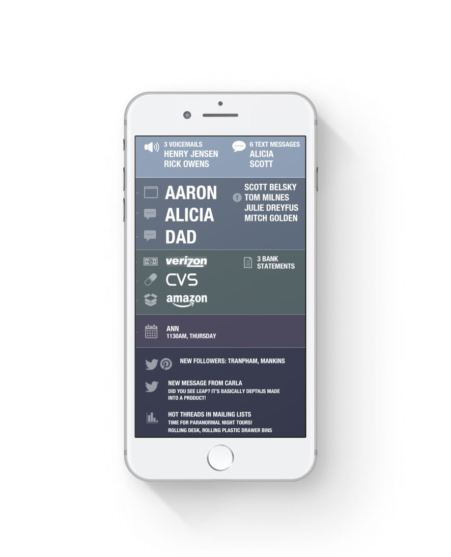
Mobile summaries
Bubbling up data from all kinds of apps and sources, Iris was meant to direct attention towards important information rather than remembering which app has which data.
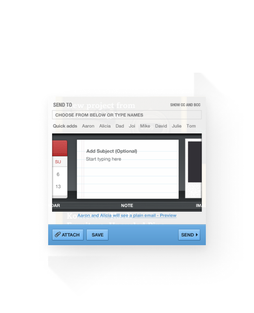
Structured compose
How can the UI be better suited to the task at hand? Why is compose a blank slate that is intent ignorant?
